
IN A WORLD OF FOR-PROFIT ORGANIZATIONS, I BELIEVE THAT DOING WORK YOU FEEL GOOD ABOUT IS A GIFT
With a BSc in Design from SFU, and experience developing a charity fundraising software platform from the ground up, I have a passion for meaningful, purpose-driven projects which benefit society
LATEST WORK
MOMENTUM
Virtual Food Cart
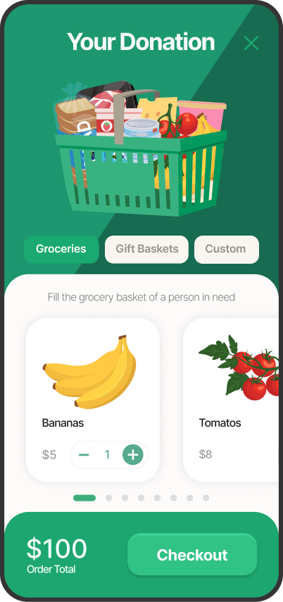
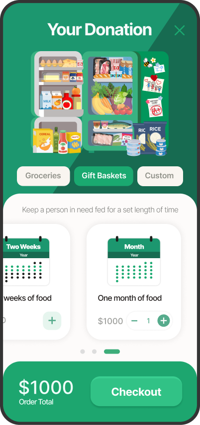
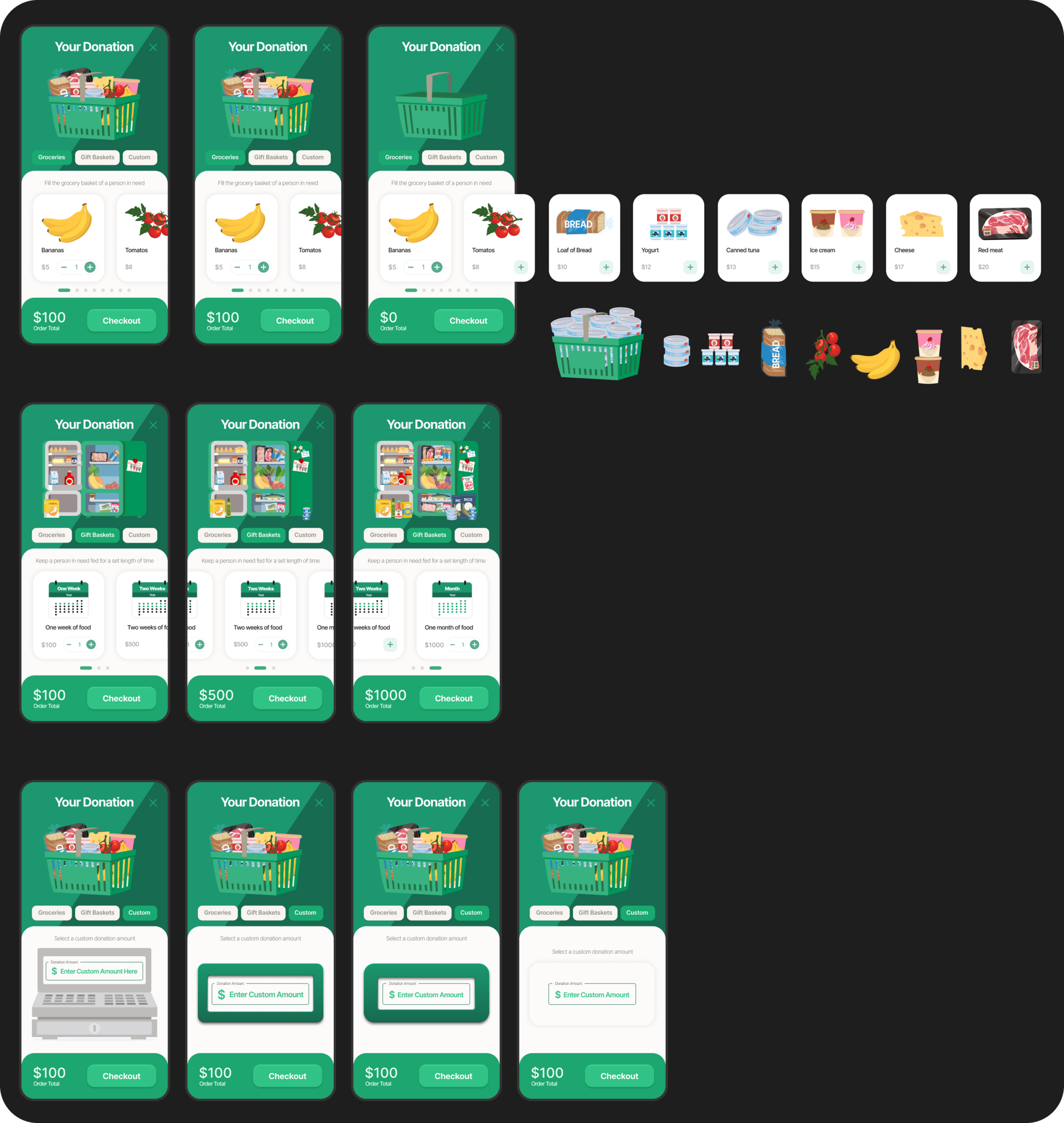
People feel a greater sense of connection to the charity they’re donating to when they understand the real world impact their contribution makes. With the virtual food cart, I wanted to illustrate that impact for the donor by visually translating dollar amounts into food. I identified three styles of donation: high interactivity, large donation amount, and simplified. I designed three modes to accommodate each way to select your donation amount. The virtual cart works for donors who want to feel the satisfaction of filling a shopping cart themselves, donors who want to see how long their contribution will last, and donors who just want the flexibility of entering their preferred donation amount.
The Process
Reviewing how existing virtual food carts worked, it was immediately evident that although they were perfectly functional as a correlate for shopping for groceries online, they lacked the playful visual style and user experience that would make them successful as a satisfying donor experience. Data showed that users were primarily accessing the previous version of the virtual cart from their phones, so when making the design responsive, I started with the mobile look first. Although it’s a popup, I wanted it to look and feel like an app – with bright, cheerful colors, simple, stripped back UI, and a stylized isometric graphic style.
The food drops into the shopping basket with a fun bouncing animation that’s previously been well received by food charities, and the fridge has little personal details on the side, like family pictures and grades that communicate the story of a family gaining the resources they need to thrive.
MOMENTUM
Animal Charity Campaign Meter
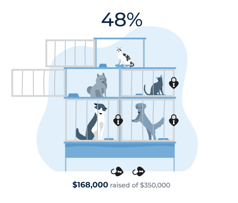
Inspired by animal charity Kennel Lock-In events, animal charities have been adopting fundraisers where they leverage their greatest resource, the appeal of the animals in their care, to inspire their donors. Meant for the main page of a campaign, this progress meter illustrates how the resources gifted to the charity translates into animals making their way to their forever homes.
The Process
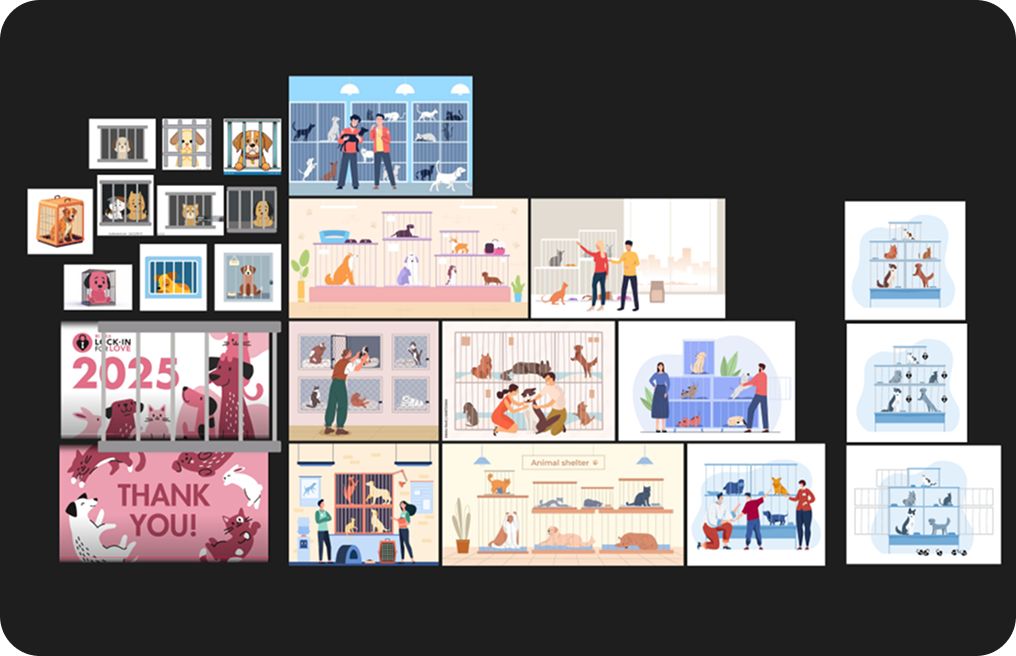
I wasn’t sure what visual metaphor to use for this meter at first. I considered a food delivery truck traveling along a road, or a grocery bag or apple filling in, but ultimately went with groceries on a scale because I wanted it to both represent the material benefit of donations raised, but also the hardship the beneficiaries of food banks feel at the till when they try to pay for their groceries. I wanted it feel like that feeling was easing as it filled. The fun animation adds to the weight of that feeling by giving the food a tangible sense of heft.
MOMENTUM
Athletic Campaign Activity Tracker
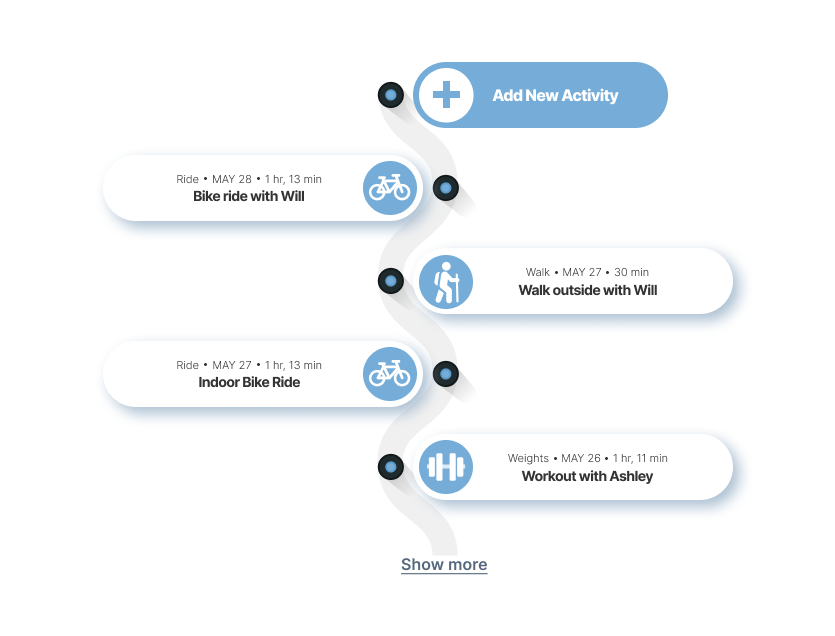
When it came time to update the Activity Tracker for campaigns which ask fundraisers to raise pledges by working out every day for a month, I wanted to give it a makeover that didn’t just look better, but better communicated the idea behind the campaign. The winding path of this progress tracker charts the progression of each daily workout with a top down skeuomorphic view of markers for each activity.
The Process
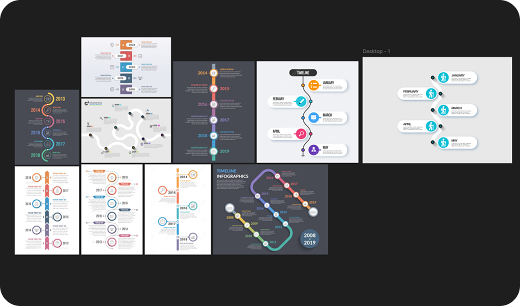
The idea for this winding path started as an exploration of different structures for timelines. I found some examples that reminded me of the abstract form transit maps can take to communicate relative distances. This felt like a great metaphor for both the physical distance traveled by fundraisers who often filled their timeline with running or cycling, but also the figurative distance they needed to go to get from the beginning of their one month of workouts to their goal.
MOMENTUM
Donor Leaderboard
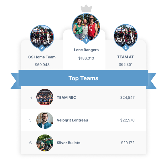
Leader boards are one of the linchpin components of any fundraising campaign site. When updating the design I wanted to make sure that it had a mostly neutral palette and used color in a way that could accommodate a broad array of possible campaign colors and still look good. That versatility also had to extend to the structure and spacing in a way that would allow me to create a stripped down version which looks good in the narrow side column of an individual fundraising page, as well as a larger more detailed version that looks good on the main page of a fundraising site. Both versions had to feel as though they were the same component and that they matched the other components used by the client.
The Process
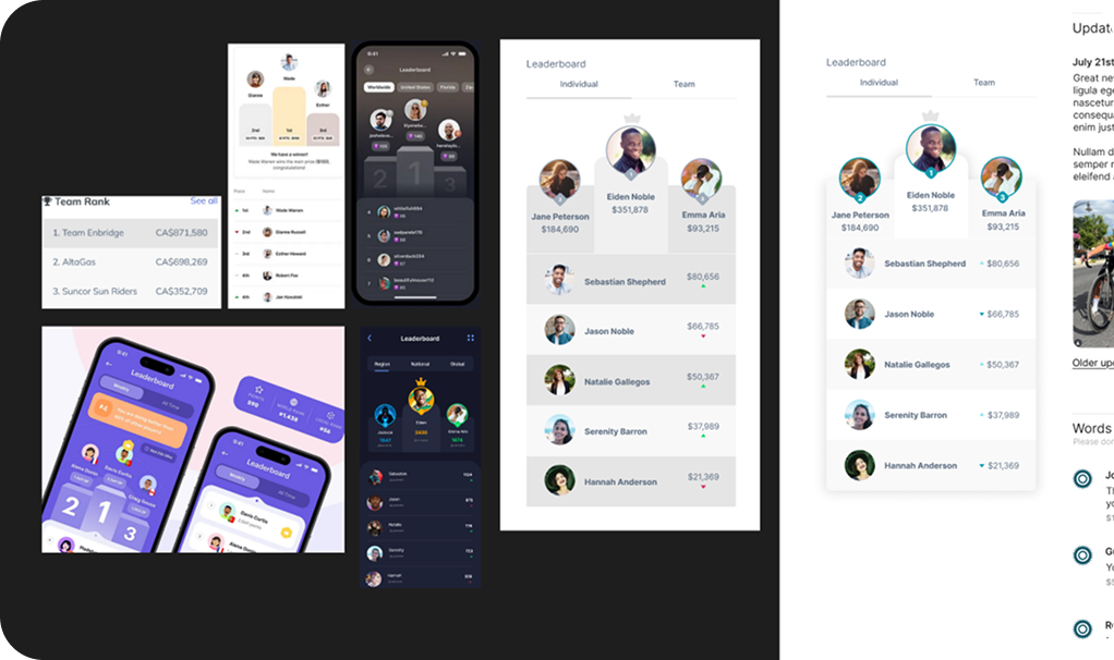
The goals for designing this component was to give it a more dynamic shape based on a winner’s podium, as well as creating a more neutral palette for the campaign colors to layer over easily. Once I had the basic shape and a sense of how I wanted the colors to contrast, it was just a process of refining the palette and layout until it fit seamlessly with the other components on the page. The large version on the main campaign page also needed to describe the type of fundraisers. I didn’t want this to just float unmoored above it, so I designed a banner that incorporated the title directly into the leaderboard so that it still feels like one complete component.
MOMENTUM
Food Drive Campaign Meter
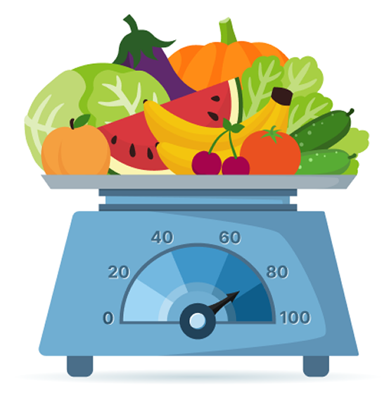
The main page of a campaign is where you have a lot more real estate to work with and also where you want to capture people’s interest. With this in mind, I’ve been designing more visually engaging progress meters which also act as a visual metaphor for the more abstract campaign goals. What I affectionately call “the fruit meter” is designed to illustrate what exactly the donors’ money and fundraisers’ hard work is going towards; more money raised translates into more food supplied to people in need.
The Process
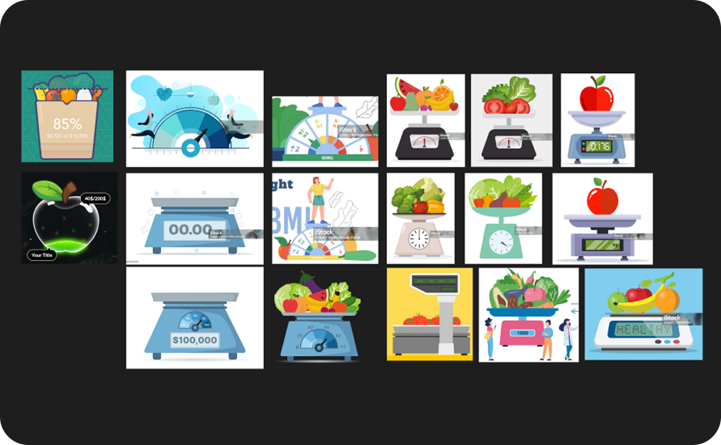
I wasn’t sure what visual metaphor to use for this meter at first. I considered a food delivery truck traveling along a road, or a grocery bag or apple filling in, but ultimately went with groceries on a scale because I wanted it to both represent the material benefit of donations raised, but also the hardship the beneficiaries of food banks feel at the till when they try to pay for their groceries. I wanted it feel like that feeling was easing as it filled. The fun animation adds to the weight of that feeling by giving the food a tangible sense of heft.
MOMENTUM
Custom Icon Progress Bar
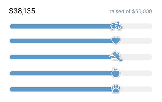
Individual peer-2-peer fundraising pages can feel quite cookie-cutter and lacking in personality and excitement. I thinking bringing in the character of the individual campaign can go a long way to making their online presence more pleasant and engaging, so I designed a series of icons that can be used to customize the progress bar based on the type of the campaign our client is running.
The Process
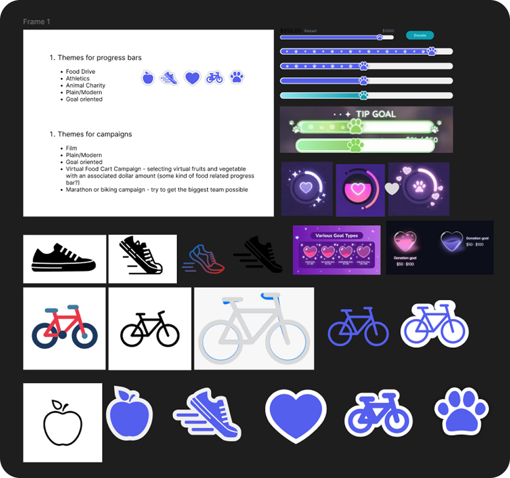
Once I had a list of campaign types, I came up with the kind of icon I wanted to represent each type. I included a heart for campaigns which didn’t have a distinct theme but which still wanted to use the icon progress bar. With a rough idea of what I wanted the icon to look like, the trick was continuously simplifying it down to its most essential form. It had to fit easily on a small progress bar, be instantly recognizable, and not compete visually with the surrounding components.
MOMENTUM
Product Website
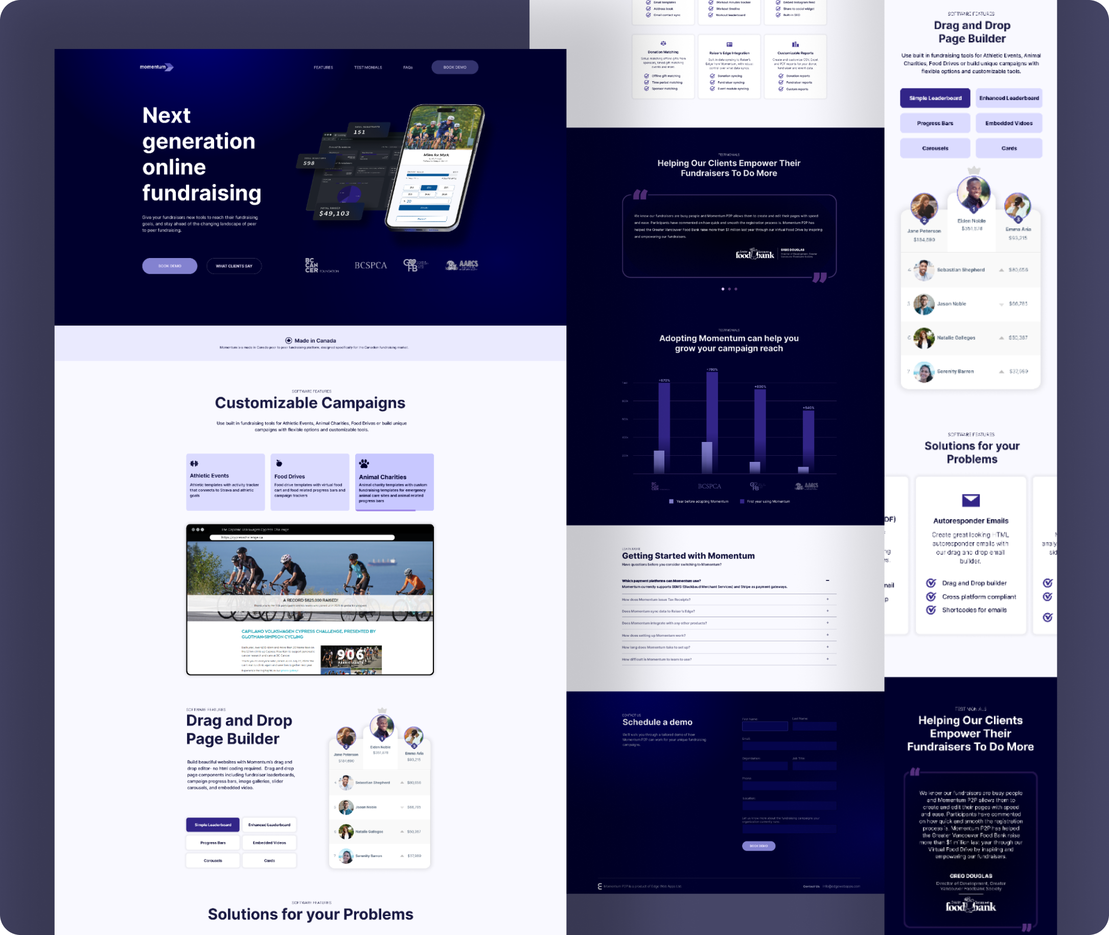
When it came time to update the product site for Momentum, we wanted something clean, simple, and structured that clearly communicated the ways in which our software made our clients’ jobs easier. The monochrome palette stitches everything together visually, with contrasting dark and light color schemes clearly delineating each section. The light sections are slightly off white, letting the featured components really pop off the page.
The software prototypes in the banner, the video of live campaigns made with our software, the interactive embedded software components, the client testimonials, and the graph illustrating how clients revenue has increased after adopting the software, all build a compelling argument for why to make the switch to our platform.
The Process
When it came time to update the product site for Momentum, we wanted something clean, simple, and structured that clearly communicated the ways in which our software made our clients’ jobs easier. The monochrome palette stitches everything together visually, with contrasting dark and light color schemes clearly delineating each section. The light sections are slightly off white, letting the featured components really pop off the page.
The software prototypes in the banner, the video of live campaigns made with our software, the interactive embedded software components, the client testimonials, and the graph illustrating how clients revenue has increased after adopting the software, all build a compelling argument for why to make the switch to our platform.
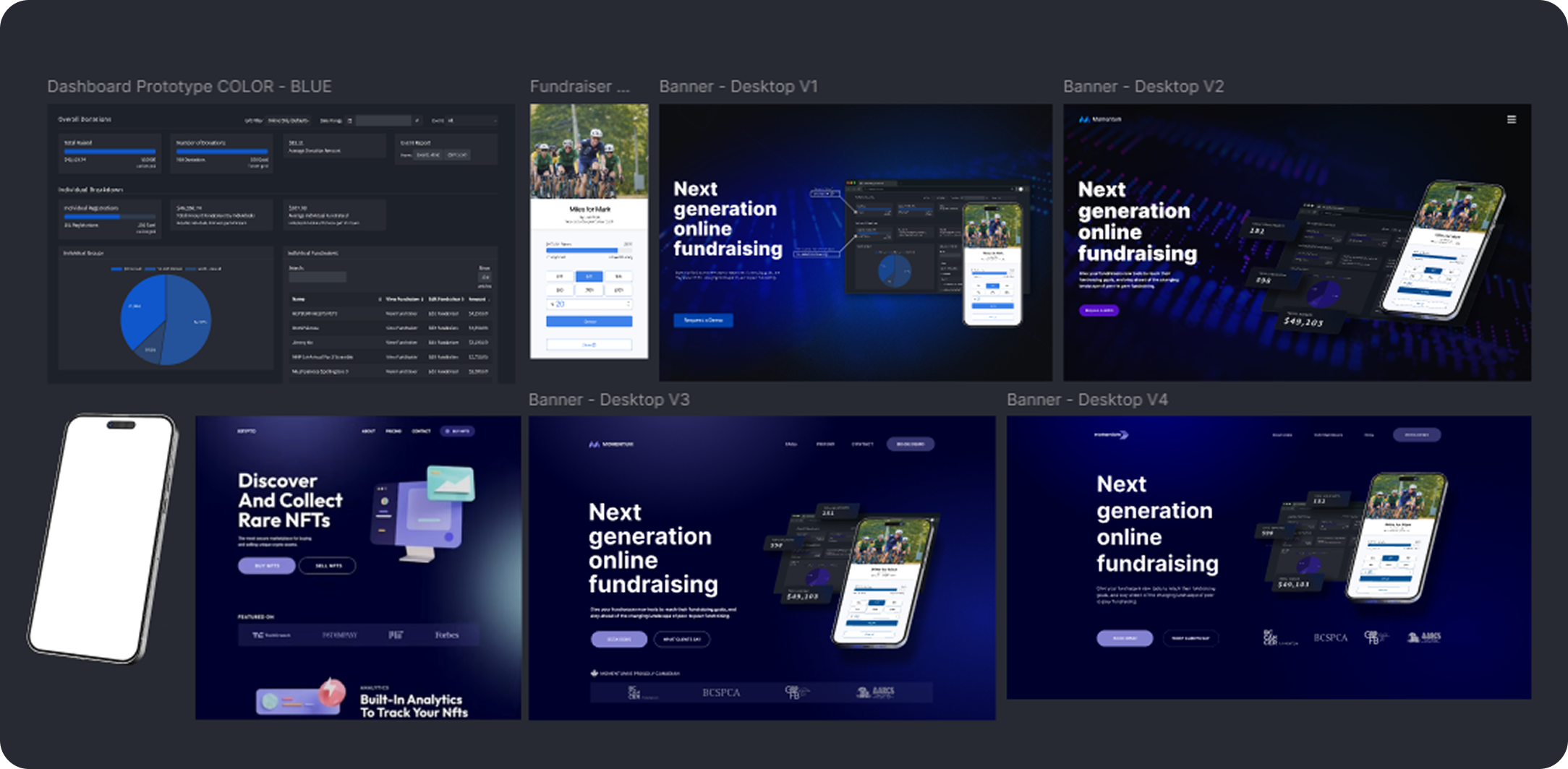
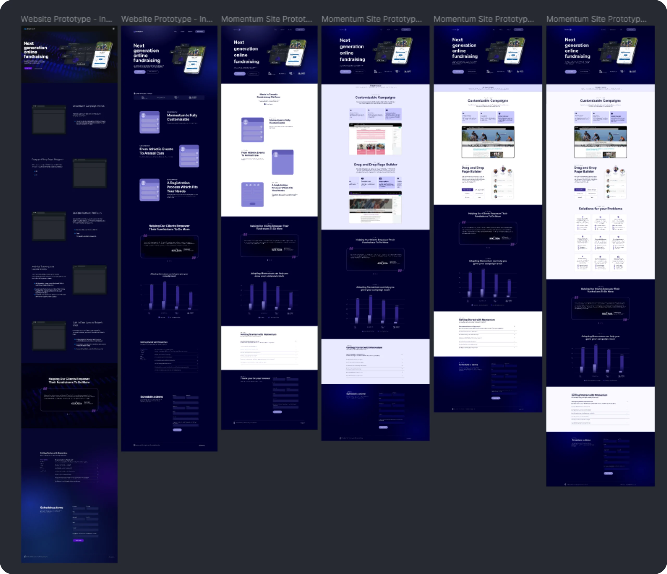
Although I knew what the supporting sections of the site would be from the beginning (testimonials/metrics, FAQ, and demo request form), the software features section underwent a number of revisions before we settled on what and how we wanted to highlight about the software.
Its evolution started out as a list of features, experimented with animations illustrating how easy it is to build fundraising pages, became two video series showing how different types of campaigns could be built and what they could look like, then moved to just the video featuring different types of real client campaigns paired with a selection of available interactive components embedded right on the page. The final version also brought the list of software features back into this section, but in a much more concise way.
BC SPCA
For the Paws Summit Site
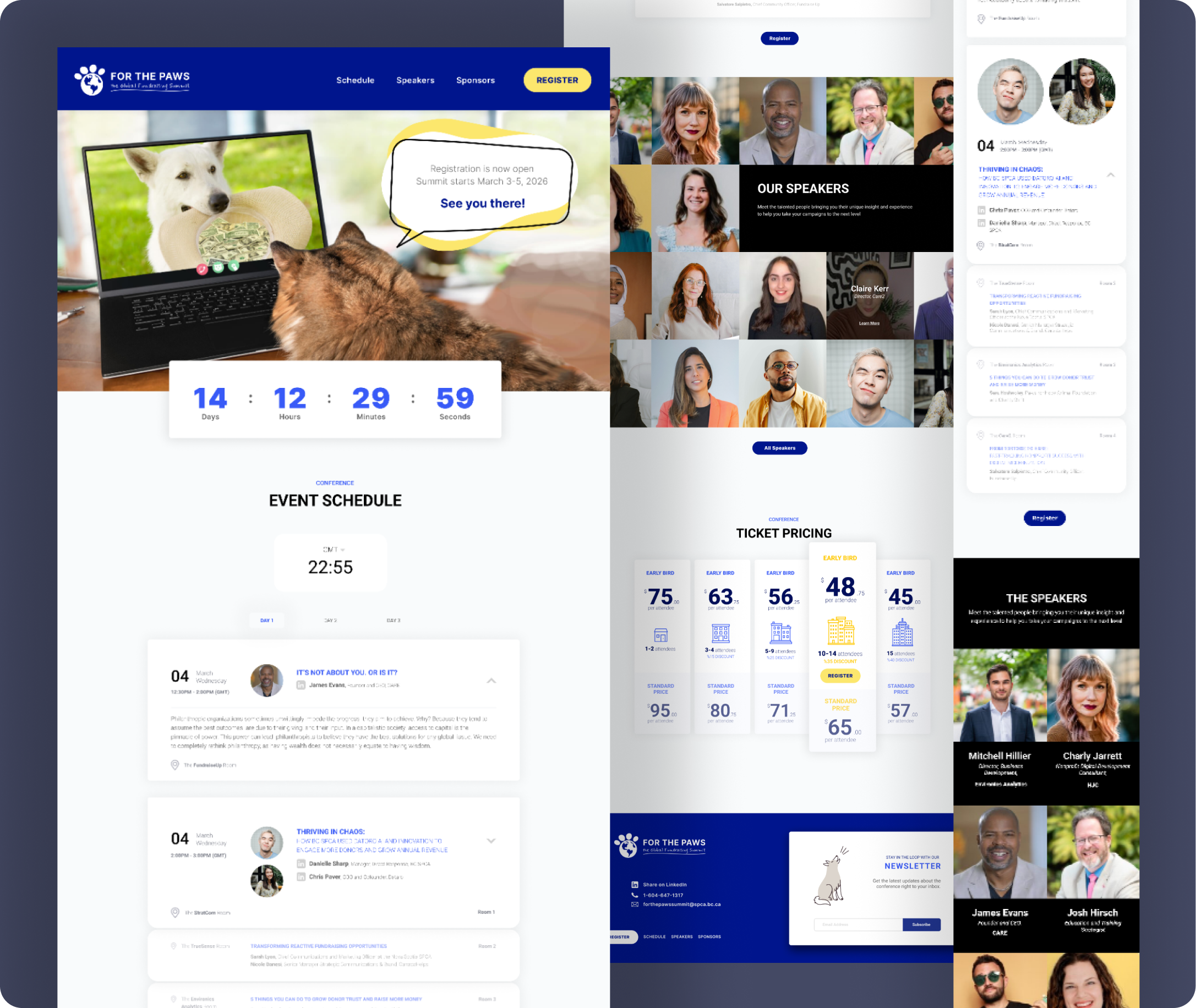
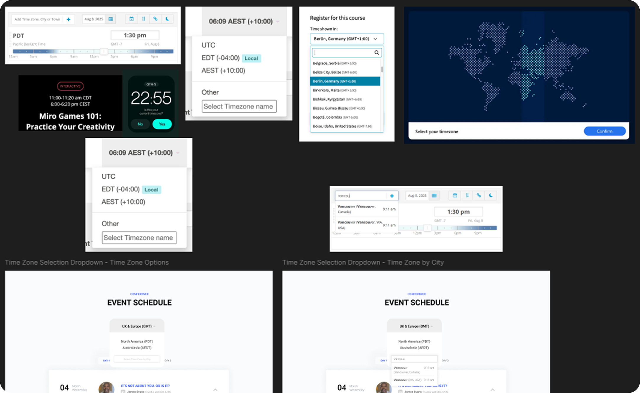
Because the summit is virtual it needed a method for switching between time zones when registrants are viewing the schedule. The clock at the top of the schedule section let’s them change their time zone, shows them what time it is there currently so they have visual confirmation they’ve selected the right zone, and updates the schedule based on their selection. The schedule also needed to visually communicate that there are multiple speakers giving their presentation concurrently in different virtual “rooms” in the same time slot, so I grouped them and made it so only one talk can open at a time for that room to keep registrants from getting confused.
I also designed a ticket pricing section that switches at a predetermined date between “early bird” and standard pricing and visually represents how much you’re saving by buying larger groups of tickets.
The Process
One of the main issues with the original conference site was the potential confusion about what time sessions were scheduled. The original site tried to solve this by giving instructions to calculate the difference between time zones and including a link to a site that where you could check the local event time zone against your own. The updated version of the site needed a solution that was simpler, more intuitive, and integrated into how the scheduling worked. The simplest solution functionally would have been to just list all the major time zones for each scheduled time slot. The solution we went with allows the registrant to select from a few major time zones, which updates the schedule accordingly.
While this works fine, an area for refinement for future updates to the site could also include the option to search by city name to select your time zone.
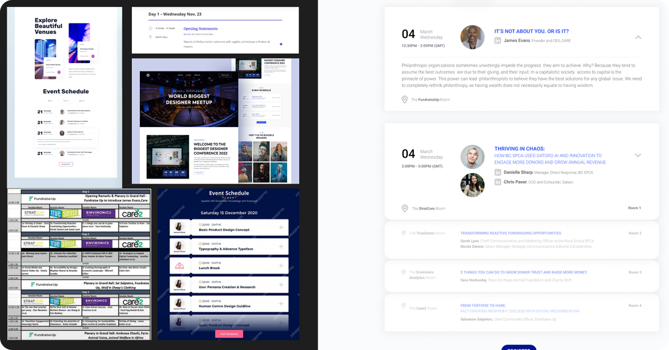
The original schedule (seen here in the bottom left) was set up in a way that only allowed enough room to include the session title, which the registrant could then use to look up what the session was about from a long list.
The updated schedule needed to organize and coherently display information based on conference day, session time slot, concurrent or single event room, and feature all of the most pertinent info about that talk easily. I did this by grouping the time slots together into one visual unit using shape and spacing and making the session info available from a drop down that only opens for one room in the time slot at at a time – visually communicating that only one of those sessions can be attended at a time.
MOMENTUM
Product Brochure
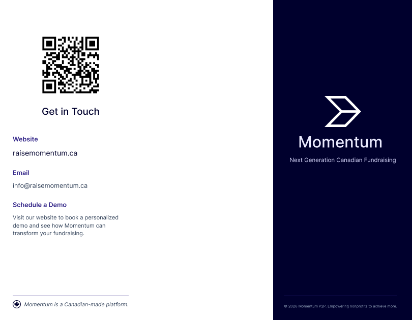
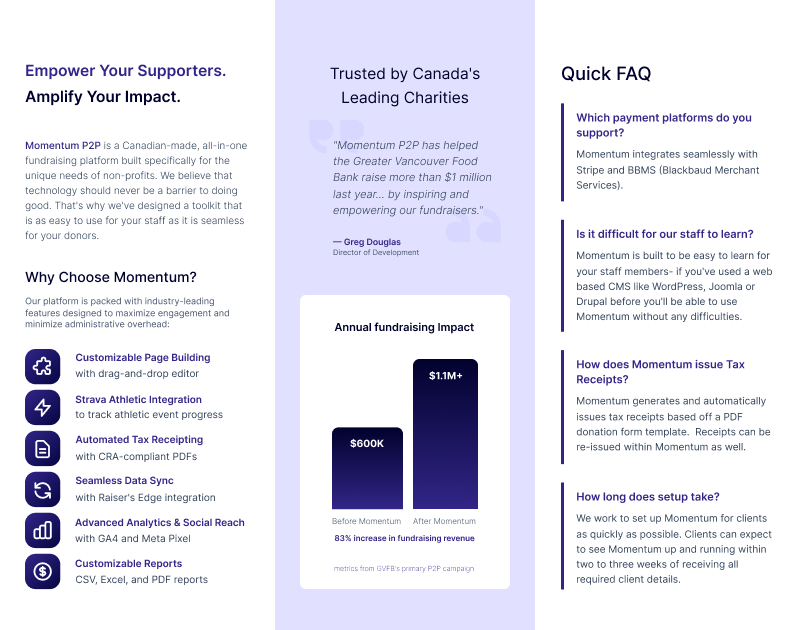
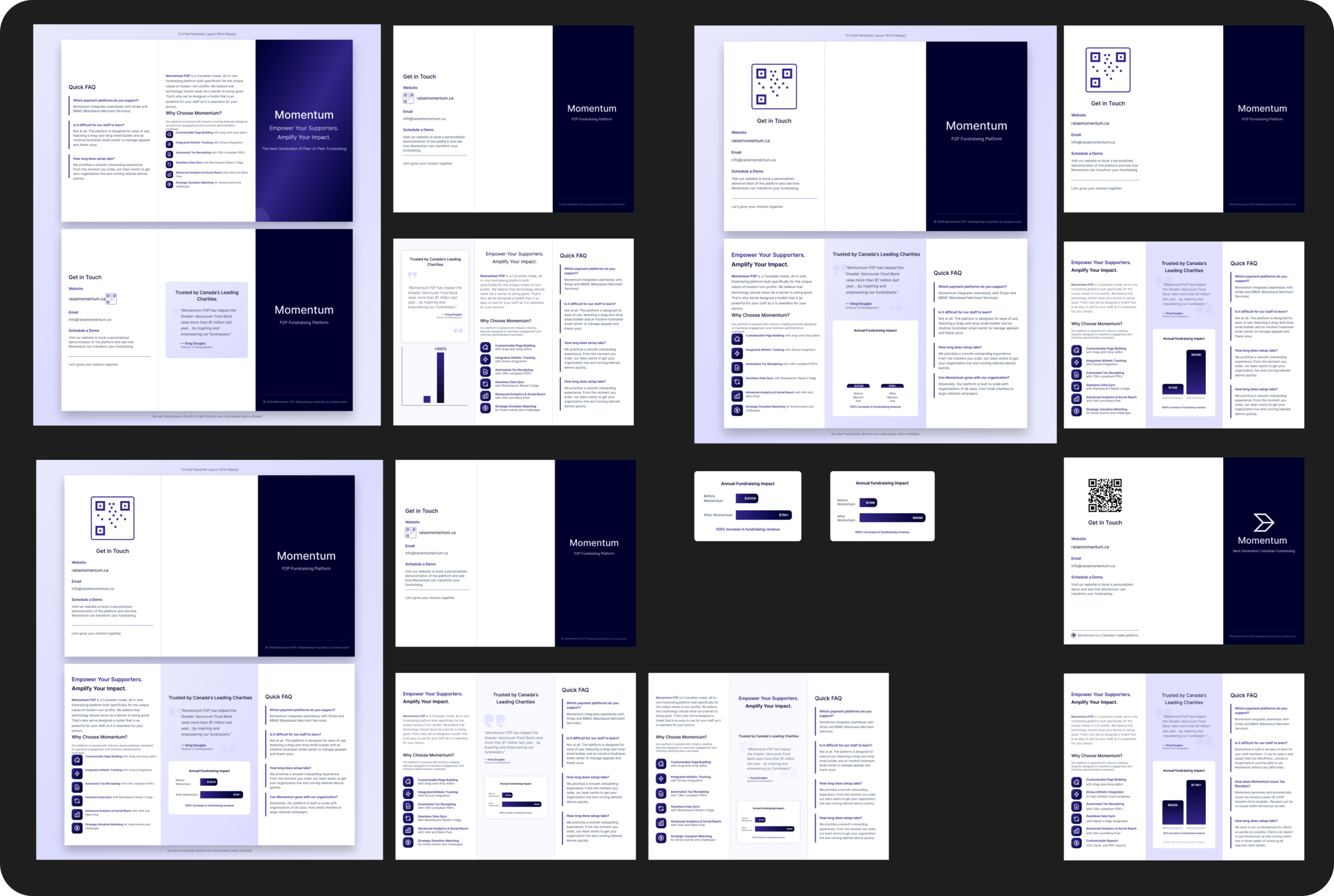
We needed a product brochure for conferences. I made it a trifold so that it was easy to carry, and because the three folds create more columns to organize the information by section.
The colors and fonts were pulled from the Momentum product website to keep branding consistent across digital and print mediums. The product logo was pulled from the company LinkedIn page because it has the greatest contrast against a dark background, which looks crisper and cleaner in print than the darker one from the website. The most important information from each section of the website has been condensed and redesigned to fit in a single section. The QR code allows the user to jump quickly to the product website for more detailed information.
The styling of the brochure matches the banner, tablecloth, and business cards for the conference.
The Process
Because the turnaround time for this project was much shorter than usual, I used Figma AI to prototype the first draft of the layout (top left). Once I had the initial draft, I copied it onto a Figma board and set up printing specifications using a plugin that automates print color, dpi, and bleed marks. From there I went back and forth switching between manually adjusting the design and fine-tuning the AI prompts until I had the layout and content as close as possible to what I wanted, before doing the final adjustments manually (bottom right).
MOMENTUM
Conference Banner
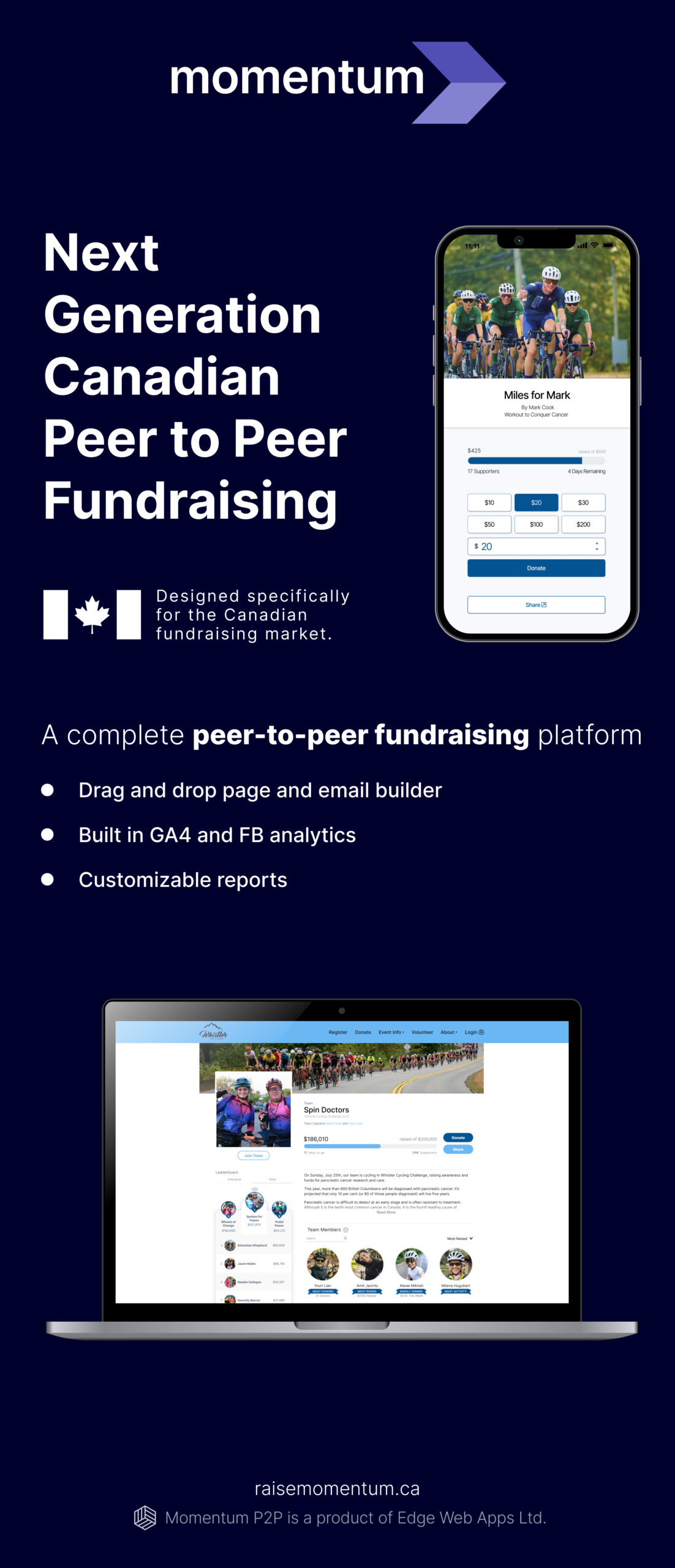
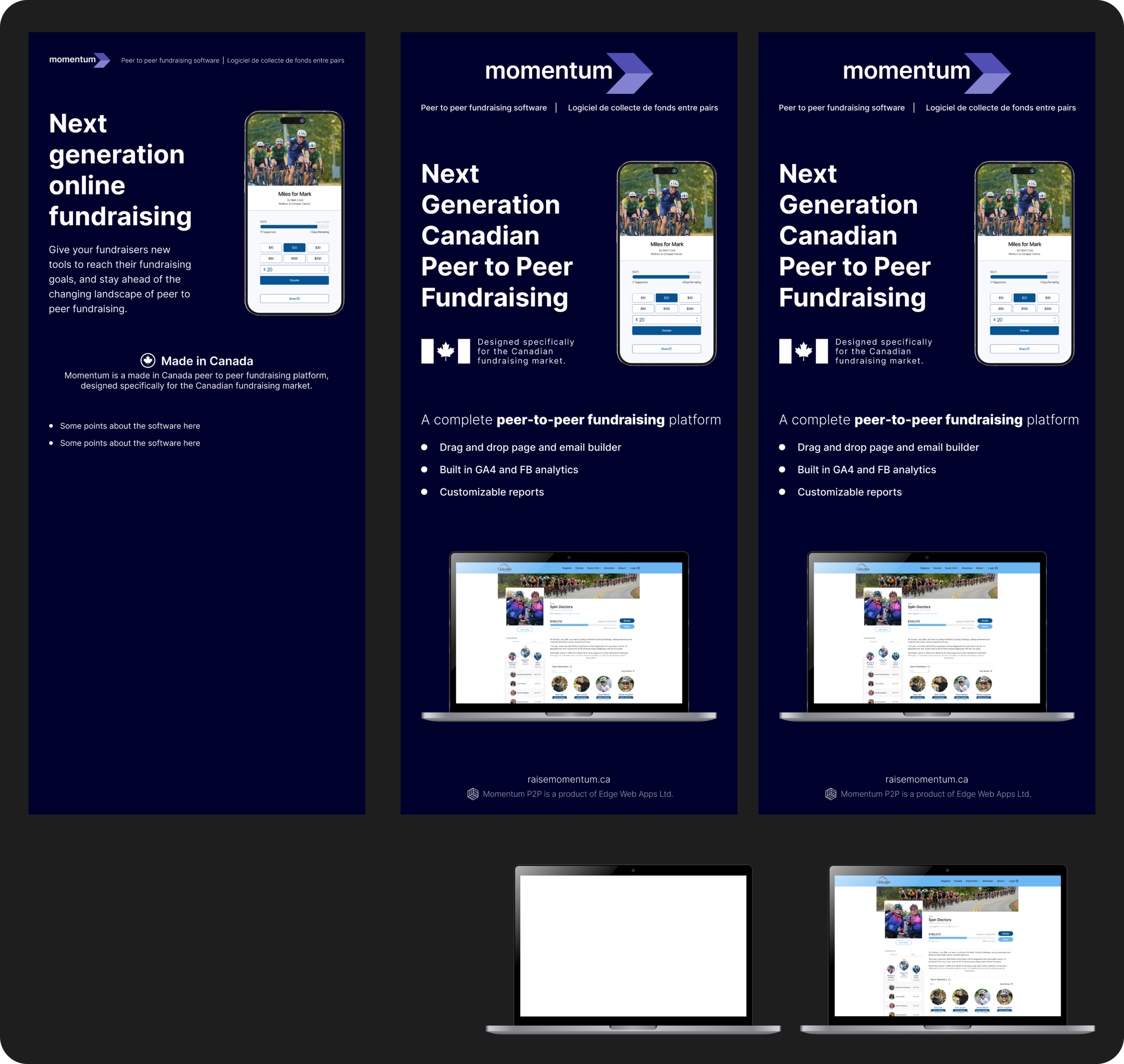
The banner needed to be clearly legible from a distance with high contrast, clear visual hierarchy for the typography, and clean mockups that effectively communicate that the fundraising process is easy and intuitive to use and looks just as good on mobile as it does on desktop.
The Process
Because the turnaround time for this project was much shorter than usual, I used Figma AI to prototype the first draft of the layout (top left). Once I had the initial draft, I copied it onto a Figma board and set up printing specifications using a plugin that automates print color, dpi, and bleed marks. From there I went back and forth switching between manually adjusting the design and fine-tuning the AI prompts until I had the layout and content as close as possible to what I wanted, before doing the final adjustments manually (bottom right).
FOR THE PAWS SUMMIT
Presentation Slides
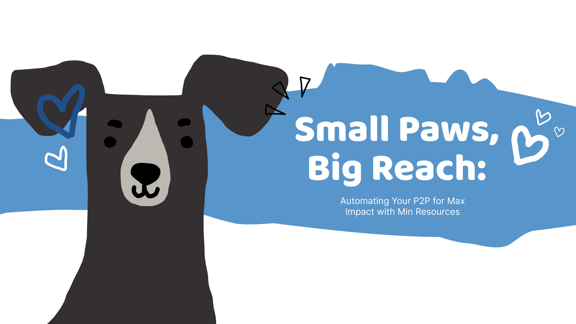
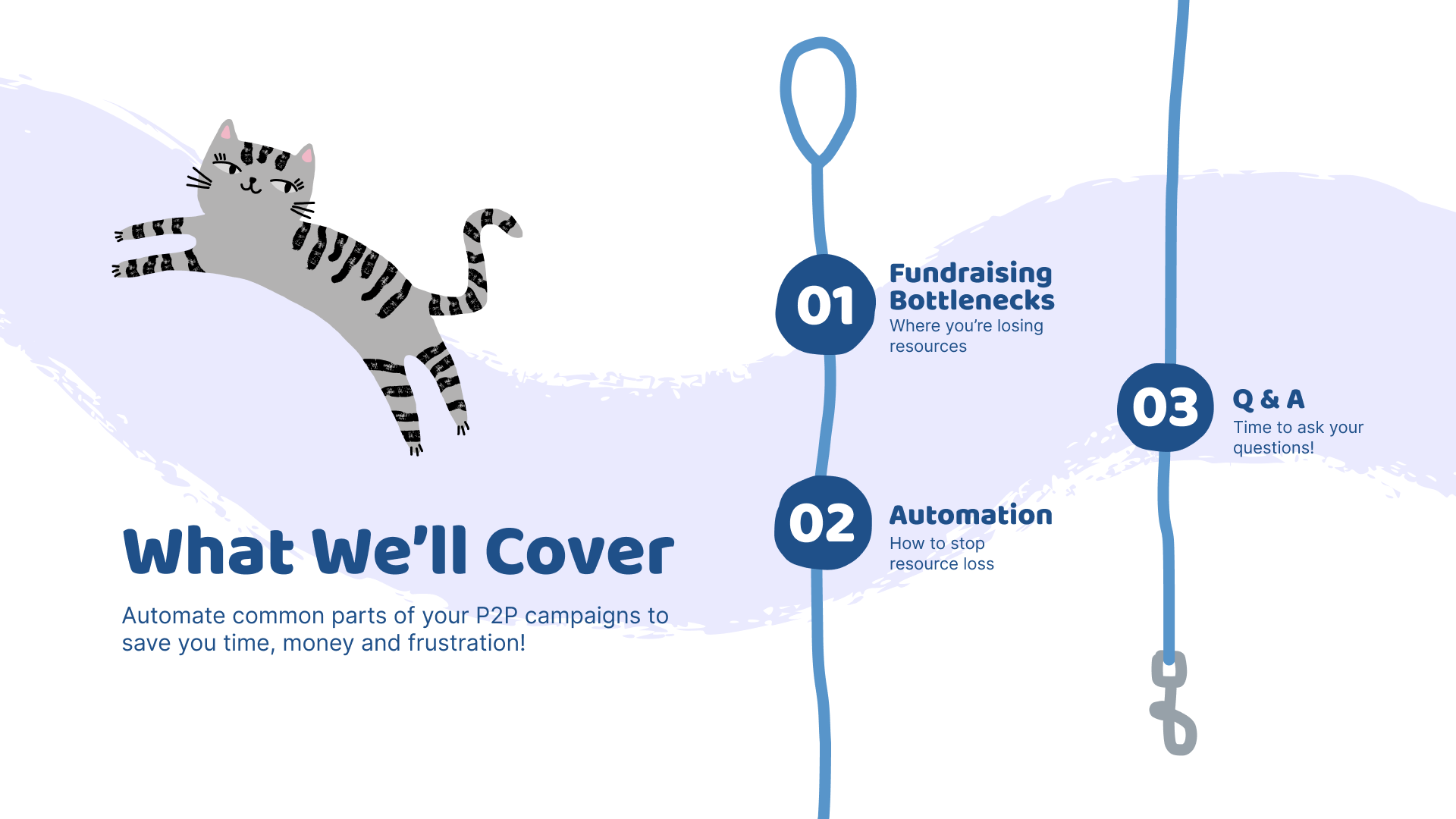
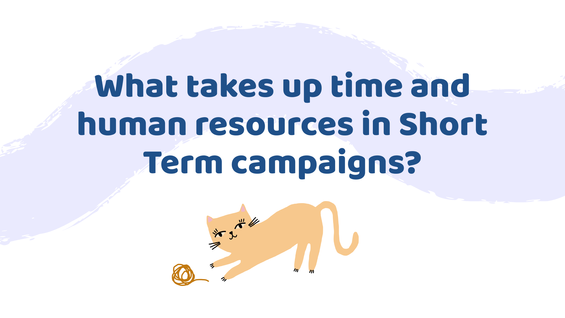
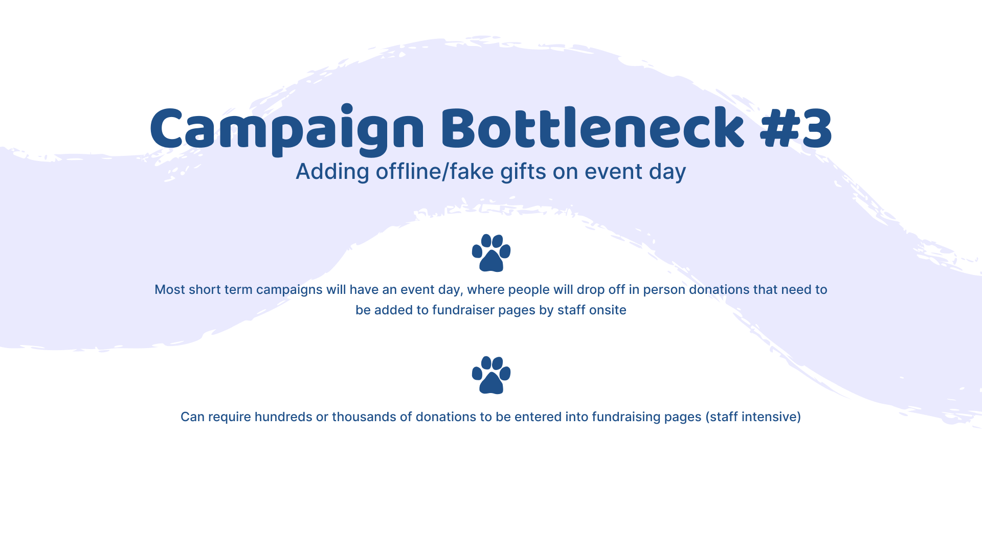
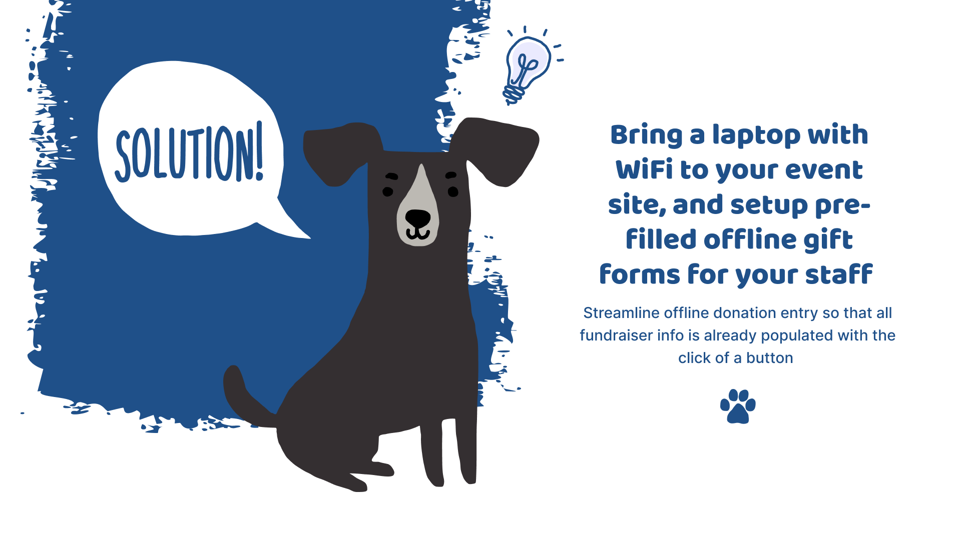
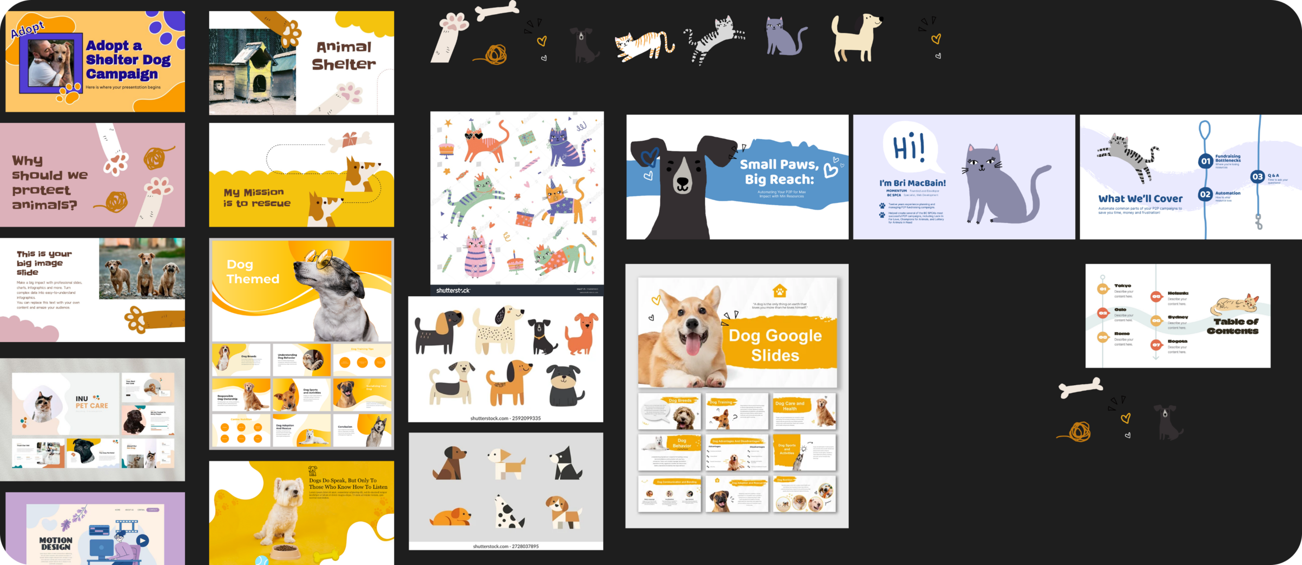
As a sponsor of the For The Paws Summit, we were invited to do a presentation teaching charity staff who have never run a Peer-to-Peer (P2P) campaign how to handle the most commonly encountered pitfalls. Because the summit is specifically for animal charities, I wanted the style to match the playful, graphic look they favor on their own sites, while also keeping it clean and easy to read since the conference was presented virtually and the audience can get visually fatigued only seeing screens and not the presenter. I focused on just a single graphic of an animal per slide and simple painterly brush strokes to stitch the slides together. Text was kept brief and easy to read with clear visual hierarchy established through contrasting size and weight, as well as by using a rounded friendly font for the titles, while a simpler, plain font was used for body text. Text and graphics were kept consistent feeling throughout by carrying varying shades of the same blue throughout the presentation.
The Process
Establishing the visual style of the graphics was the most important step. Figma had recently introduced different brush types for shapes, so I wanted to experiment with a looser, more hand drawn look. I looked for cartoon and slide inspiration that were abstract and playful to inspire me.
CALGARY AFP COMPASS 2026 CONFERENCE
Presentation Slides
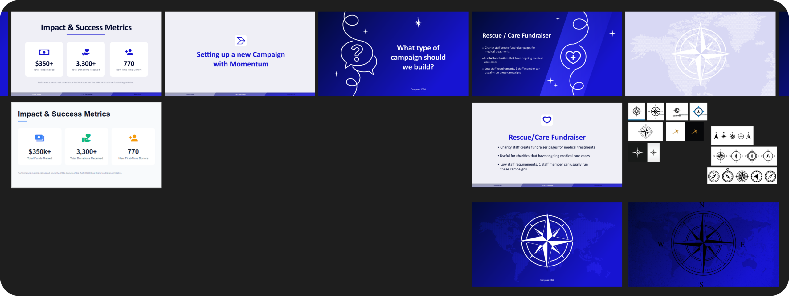
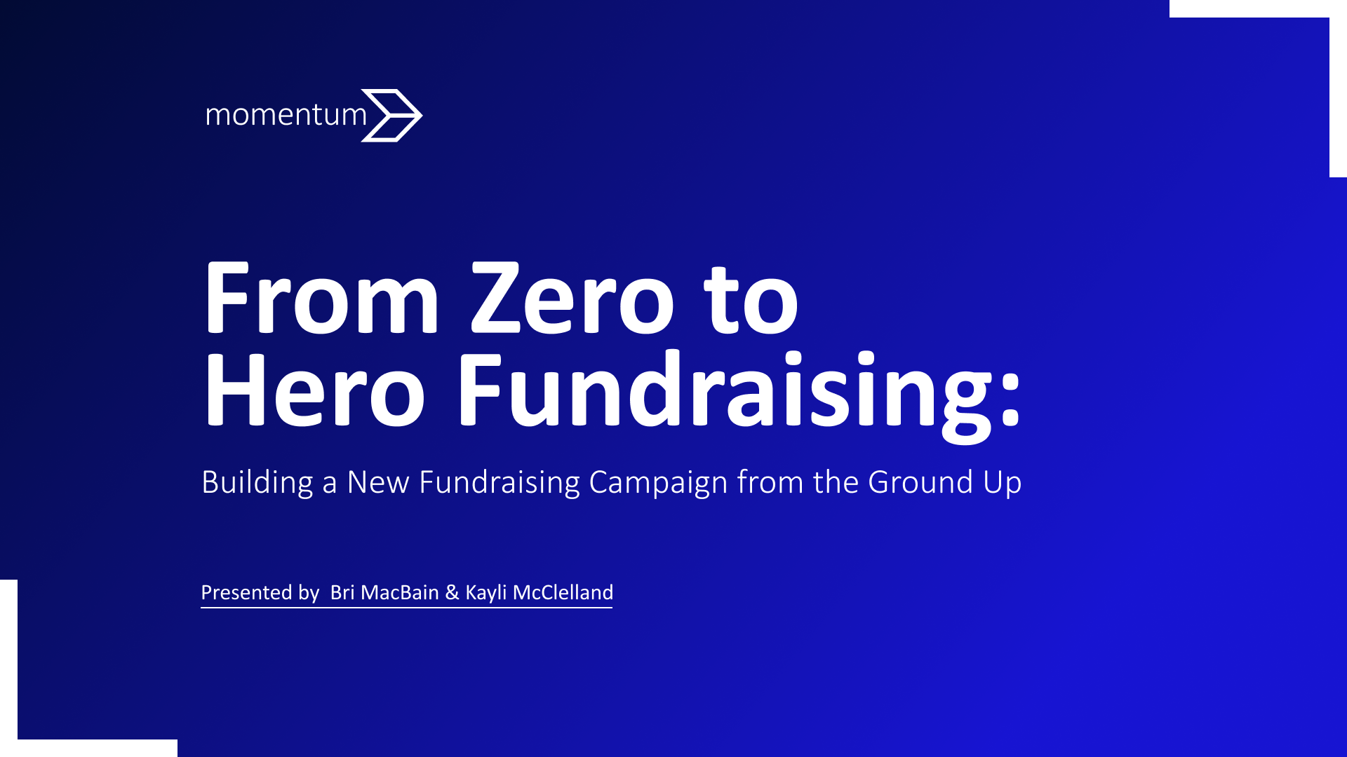
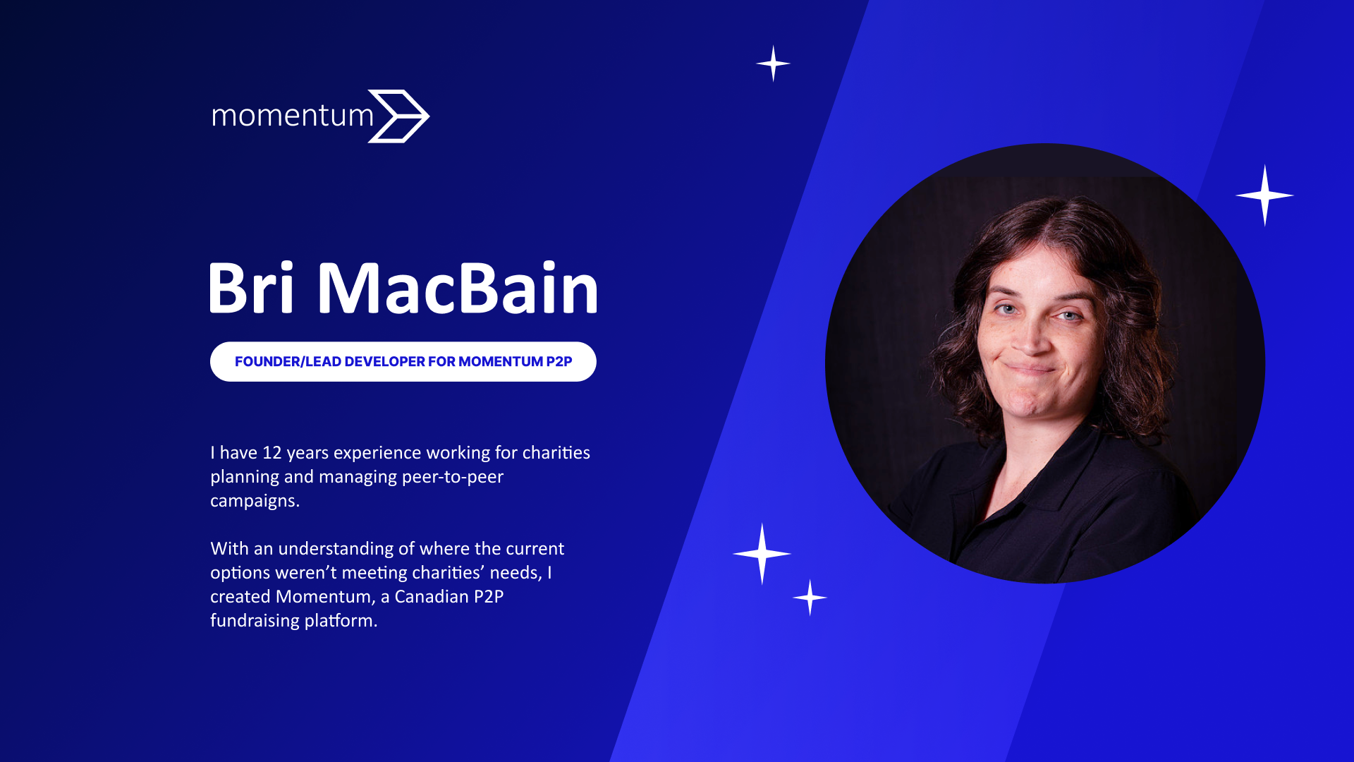
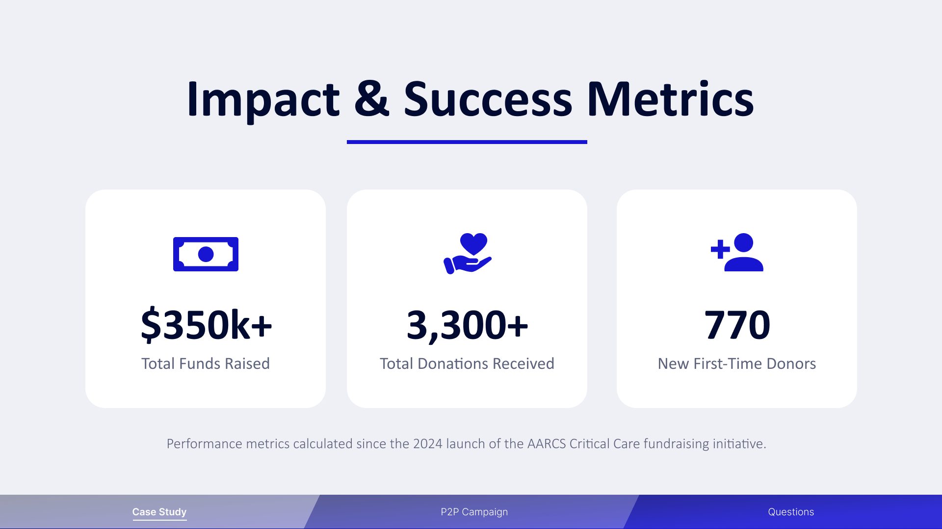
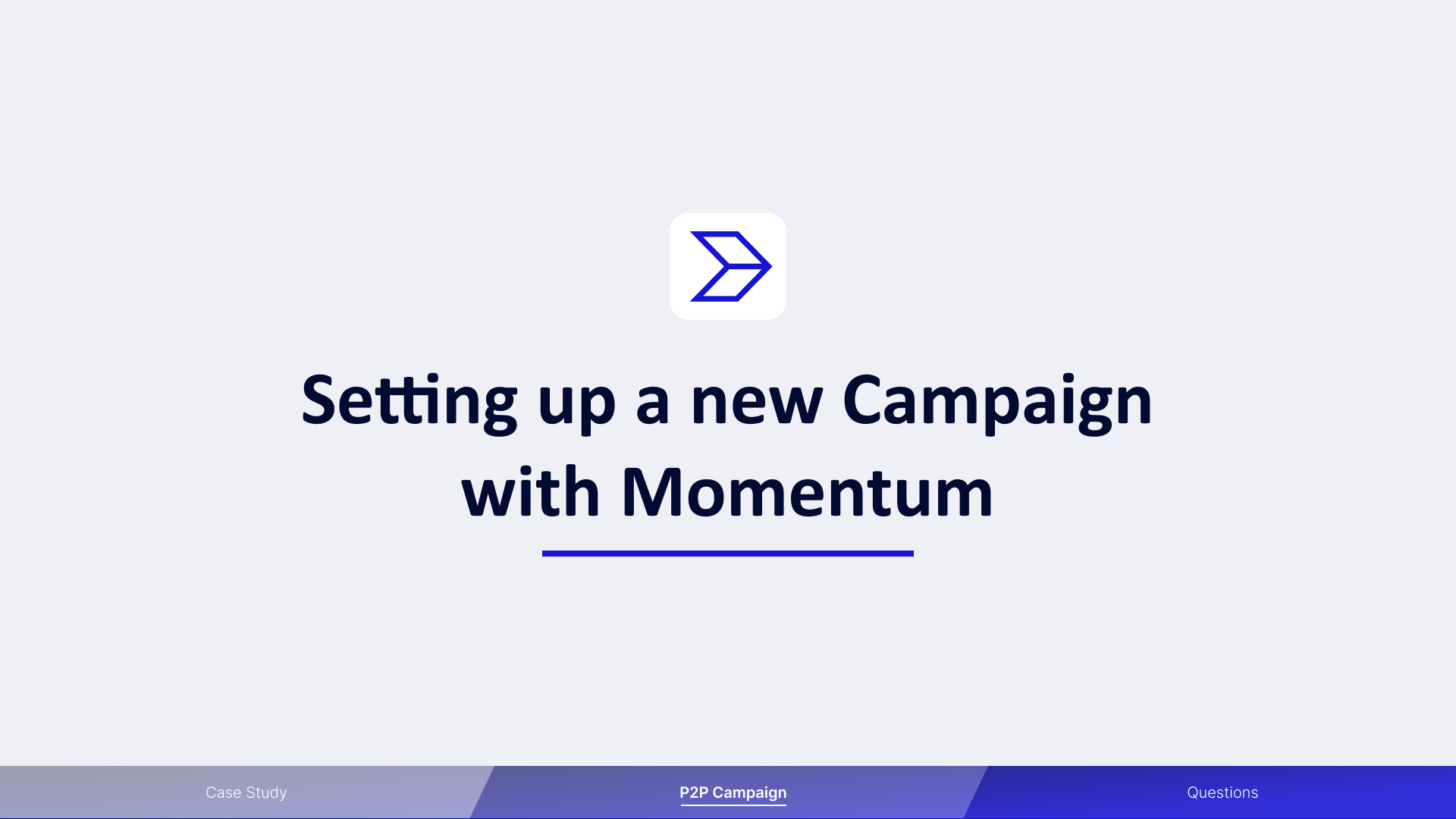
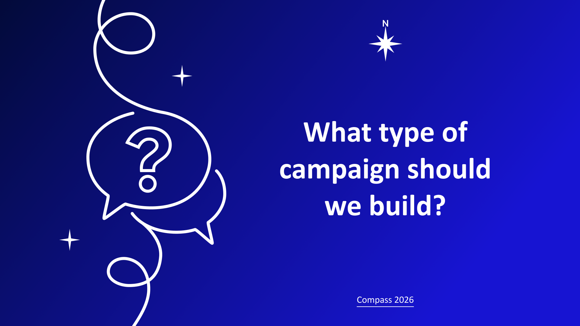
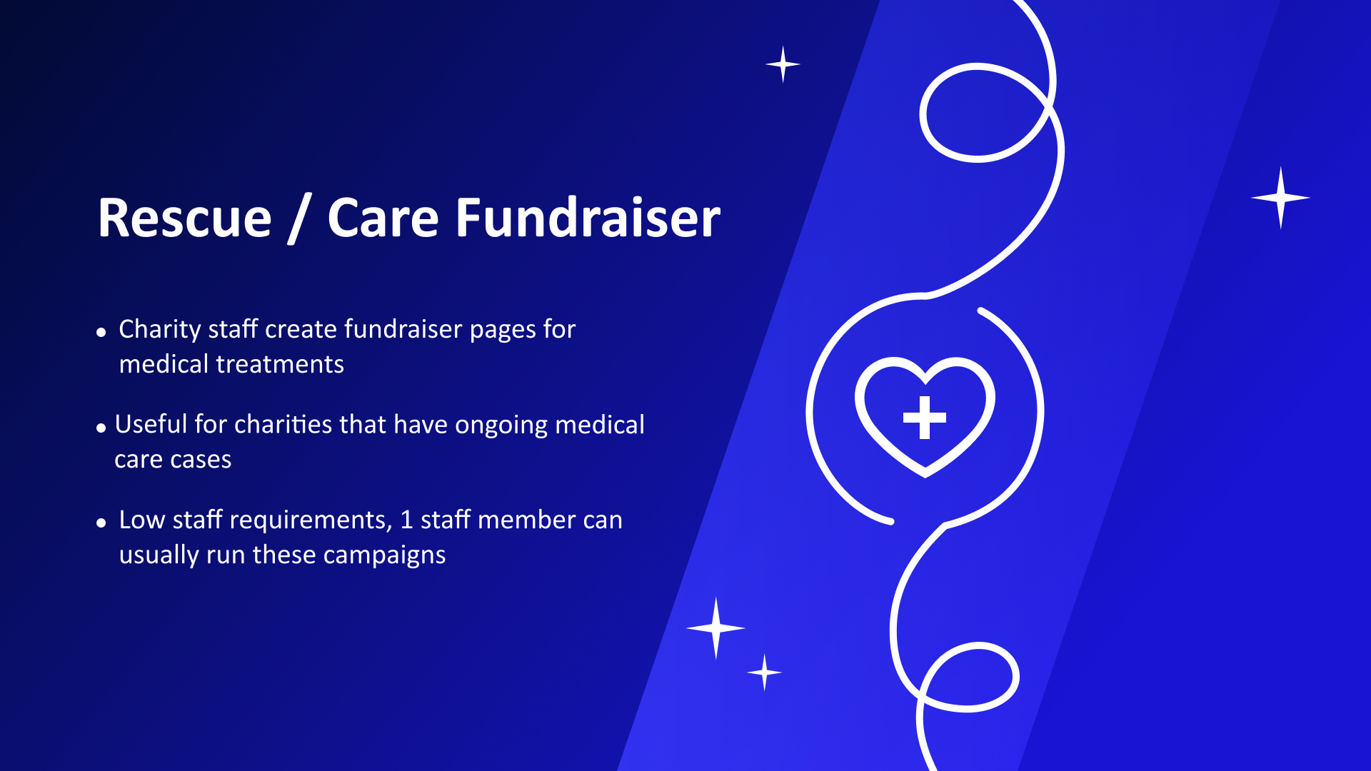
We did a talk with one of our clients discussing how they ran their very first campaign and how what they learned could be adapted to starting a variety of campaigns from scratch. Matching the visual theme to that of the conference acting as a compass to guide the charity sector, I gave the presentation a night sky with a guiding north star visual theme. The slides alternate between light and dark to keep the audience from becoming visually fatigued, with the midnight blue color scheme carrying through the light slides to keep it consistent. Typographic design is clean and simple so that it doesn’t compete with the visual theme and it’s easy to read on a projector in a large conference room.
The Process
The color scheme was designed to match our product website and corporate colors. The slides were designed totally in Figma, while the photos were edited in Photoshop to match each other and the look of the slides. The text was organized in Google Slides and edited for brevity in Google docs using their AI Gemini, then the topographic design was done in Figma.
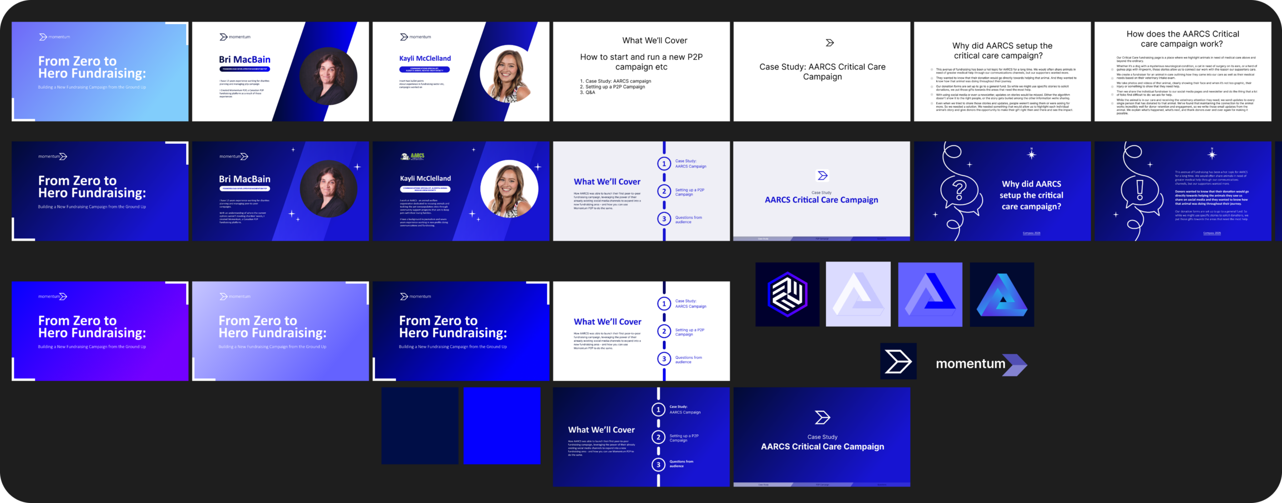
Some slides, such as the Metrics slide, was generated by AI in Google slides, and then the final version was designed by hand by me in Figma. All the other graphics were made by hand in Figma.